
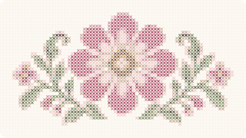
Retro and vintage cross stitch does not have to mean copying old charts exactly. Often the appeal comes from borrowing certain visual decisions —palettes, type styles, everyday objects, geometry or nostalgic composition— and using them in a new design. The technique may be traditional while the finished piece still feels completely current.
That lets a project have personality without turning the room into a themed set. One reference can be enough: a camera, radio, seventies-inspired flower or short word in a typeface that suggests another era. The useful question is identifying which part of the retro aesthetic you actually enjoy.
What makes a cross stitch pattern feel retro
Palette is one of the strongest signals. Mustard, terracotta, olive green, brown, cream, dusty pink and petrol blue create a very different mood from a set of bright, cool colors. You do not need all of them; three or four well-chosen shades can be enough.
Shapes matter too. Arches, suns, large flowers, stars, checkerboards and simple geometry can suggest past decades without copying any one historic object. They translate particularly well to cross stitch because many of those forms already work naturally with a grid.
Everyday objects offer another route. Old telephones, cameras, record players, televisions, coffee pots and cars all work as compact decorative icons. The clearer the silhouette, the more naturally it translates into crosses and remains readable at a small size.
Typography completes the effect. Thick rounded letters or geometric type can make even a completely contemporary word feel retro. Keeping the wording short also gives each letter enough room to carry more character.
Vintage does not always mean muted color
Some retro aesthetics are soft, but others use extremely strong contrast. Red with pink, orange with blue or green with yellow can feel completely coherent when the shapes and color relationships are intentional. Treating “retro” as another word for beige removes too many possibilities.
If you want an aged background, cream or beige fabric can replace pure white without changing the floss. Hand-dyed Aida can add texture too, although it is worth checking that the holes remain easy to see and the background does not compete with the motif.
Avoid trying to create “vintage” simply by making every color dull. A strong palette still needs hierarchy: one or two shades should lead, others should support them and the background must allow the image to read clearly. Even muted combinations benefit from a point of contrast.
You can also mix periods. A seventies-inspired motif inside a very simple contemporary frame may be more interesting than trying to reproduce every detail of a historic interior. The reference usually works better when it does not become a costume.
Retro motifs that work well as small projects
Food and drink are particularly playful subjects: cherries, a coffee cup, generic bottle, cake or cocktail can become compact kitchen pieces with plenty of personality. They are easy to recognize from simple forms and support saturated palettes.
Large simple flowers are equally effective. Rounded petals in mustard and orange can feel immediately seventies-inspired while remaining extremely straightforward to stitch. Repeating the same flower at several scales creates movement without adding a large number of colors.
Celestial motifs —suns, moons and stars— make compact compositions too. With three or four colors, they fit small hoops and can be combined into a series. An arch or a few wavy lines can complete the composition without making it technically busy.
For gifts, an initial or short word in retro lettering can feel more personal than a generic quotation. Keeping the text brief gives the letters enough size to preserve their character and avoids spending hours following tiny outlines.
How to use retro cross stitch without overloading a room
A nostalgic design can sit comfortably in a modern home when the frame is simple. Light wood, black or a solid color gives the piece character without adding another layer of ornament. The contrast between handmade technique and clean presentation often works especially well.
If you group several pieces, repeat part of the palette. A floral design, food motif and geometric chart can become a collection if they all share mustard, cream and green, for example. They do not need to belong to the same subject category.
Nothing else in the room has to be retro. The contrast with contemporary furniture may actually make the stitching more interesting. Treat the pattern like an illustration with a particular visual reference rather than an instruction to decorate the whole space in one period.
When choosing a chart, look past the word “vintage.” Ask what you actually like: the colors, lettering, object, composition or a particular kind of nostalgia. That answer makes it easier to find related pieces without buying patterns that share nothing except a marketing label.
The strongest retro cross stitch uses nostalgia as a visual language rather than a costume. It keeps the tactile pleasure of a traditional technique while pairing it with imagery that remembers another era and still works comfortably on a contemporary wall.
If you want to test the style without committing to a large project, begin with a motif using fewer than ten colors. Seeing how mustard, terracotta, green and cream behave on real fabric will tell you much more about whether you want to build a full retro collection.
In an original collection, the interesting part of retro style is being able to use a visual reference without copying a specific object or brand. We can work with recognizable palettes, shapes and compositions and turn them into original designs that feel nostalgic while still having an identity of their own.
