
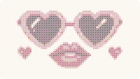
Monochrome cross stitch shows that a design does not need many colors to be interesting. Working with one floss reference —or a very small family of shades— puts all the visual weight on shape, composition and the rhythm of the stitches.
It also simplifies organization and can become a very relaxing way to stitch. But “one color” does not automatically mean “easy”: a large design or one built from fine separated lines can require a lot of counting.
Which subjects work especially well in monochrome?
Silhouettes, animals, branches, architecture, lettering and geometry translate well because they depend more on outline than shading.
Stylized portraits can work too when the face is reduced to clear light-and-dark masses.
Highly realistic scenes usually need more shades to retain depth, although they can be reinterpreted as silhouettes.
One-color charts also work when you want thread texture and the grid itself to become important.
Choosing floss and fabric color
Black on white is the obvious combination, but far from the only one. Petrol blue on cream, burgundy on beige or white on black Aida can completely change the mood.
The stronger the contrast, the more graphic the result feels.
For a softer look, combine related values: gray floss on cream fabric or deep green on pale sage.
Make a small sample first and check coverage and contrast from the normal viewing distance of the finished piece.
Practical advantages of using one color
There are no large floss organizers and very little symbol checking.
Thread changes are faster because you always return to the same reference.
It is convenient for travel and stitching away from home.
Buying several skeins is also simple when a large project uses a lot of the same shade.
What can make monochrome harder than expected?
Counting becomes more important because color changes no longer create visual boundaries between sections.
Long separated lines can make it easier to lose your reference point.
A full-coverage monochrome chart can still contain an enormous stitch count even though only one color appears in the key.
Consistent tension becomes more noticeable because the whole surface shares the same texture.
How to make monochrome cross stitch feel modern
Use one large simple composition rather than filling the frame with tiny details.
Leave generous negative space around the motif.
Choose an unexpected floss color instead of always defaulting to black.
A simple frame and wide margin reinforce the feeling of graphic wall art.
Monochrome patterns prove that visual complexity and color count are not the same thing. One floss shade can create a very strong piece when shape is well designed and scale suits the space where the work will live.
If the project is large, buy enough of the chosen color at the beginning so the work is not interrupted later. With hand-dyed floss, this matters even more because separate batches can vary.
Monochrome patterns fit the identity we want to build because they force the shape to work properly. Without shading or ten colors to rescue a weak silhouette, every line and area of negative space carries more responsibility.
They also create very simple project preparation. One floss reference, a well-chosen fabric and a clear chart remove much of the setup friction, which is especially appealing to someone who wants to stitch without organizing a full palette.
In our shop, monochrome can be divided by style: botanical, architecture, animals, lettering or geometry. The same technical logic can produce visually different collections while keeping a consistent stitching experience.
The product page should include an approximate floss estimate when the design is large. With one dominant color, running out halfway through is easy to avoid if we provide a sensible estimate based on fabric count and strand number.
We can also offer color suggestions without duplicating the chart. Black on cream, blue on white or burgundy on linen can completely change the personality while the grid remains identical.
That makes monochrome useful both as an accessible entry product and as premium wall art: the value comes from composition quality rather than the number of colors included.
For larger pieces, another advantage is that customers can choose the dominant shade to suit their home without us maintaining separate chart versions. We can recommend tested combinations while the technical pattern stays identical. That simplifies catalog management and support without reducing useful choice.
Monochrome designs also make quality control easier to communicate: with no palette complexity to hide behind, spacing, silhouette, negative space and symbol clarity become immediately visible. A strong one-color pattern therefore says a great deal about the underlying quality of the design.
